NAE Mobility
Brand identity design
Brand design for an Electric Mobility brand called NAE Mobility
Client: NAE Mobility Pvt. Ltd
Project Done in Collaboration with Marching Ants Marketing LLP
Electrifying Mobility Solutions
NAE Mobility is a new startup based out of Bengaluru, focusing on various applications of passenger travel, commercial movements as well as personal vehicles. NAE Mobility aims to build reliable, high-performing, qualitative, and competitively priced products to encourage and enhance Electric Mobility in India thereby contributing to reducing carbon emissions to have a greener environment.
The company aimed to establish a strong brand identity that reflected its commitment to sustainability, Accessibility, innovation, and the future of urban mobility.
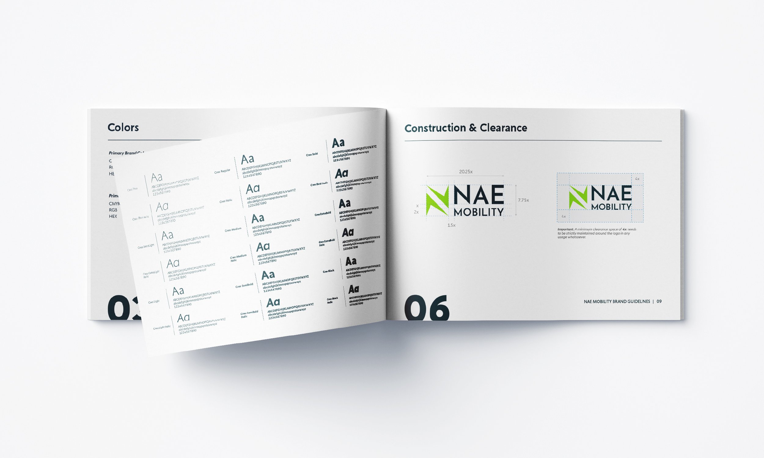
At its core, the brand identity centers around the universally recognised symbol of Electricity - the "electric spark"! For the logo, the spark icon splits into two creating two ‘arrow’ symbols representing movement/mobility which then come together to form the letter 'N' for NAE Mobility. Lastly, the usage of green is to signify sustainability and sets the (Pan)tone for many green innovations to come.