Juuso
Brand design
Packaging design
Brand and packaging re-design for JUUSO - The Juice Company
Client: Juuso - The Juice Company

Design for Visibility
What do you think of when you hear packaged fruit drinks? Frooti? Tropicana? Perhaps, Real? What all of these have in common is a strong visual brand that took years to become part of the average Indian kirana store. How does one compete with these? A mighty task even for a well-established company, let alone a new entrant in the market.
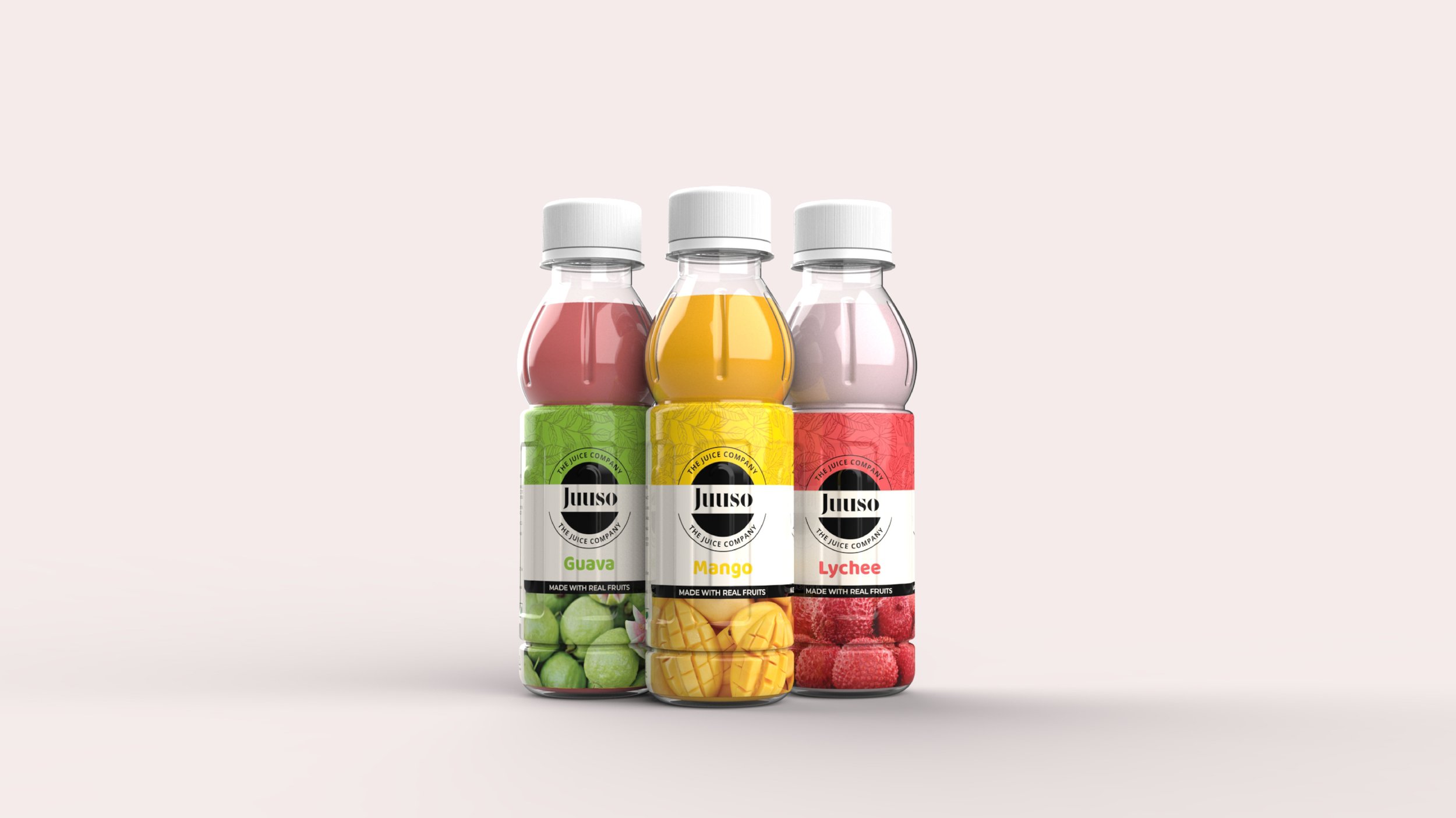
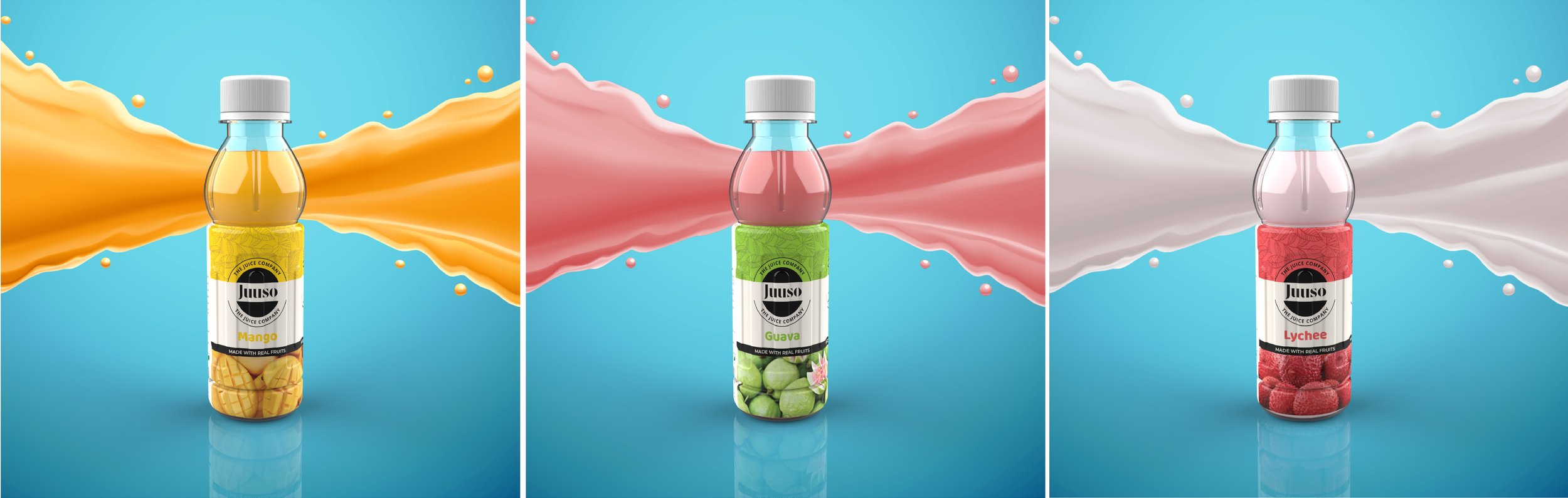
We strived to create a brand for Juuso that would help establish its presence on the shelf. The aim was not to beat the competition—that part comes much later—but to help the new product be seen on a shelf dominated by well-recognized products.

The biggest hurdle to visibility was the old name of the product: Juico. While it was intended to be pronounced as Juice-oh!, it was anything but. Most patrons referred to it as jukko. The first order of business was to simplify the name. It is now spelled Juuso.
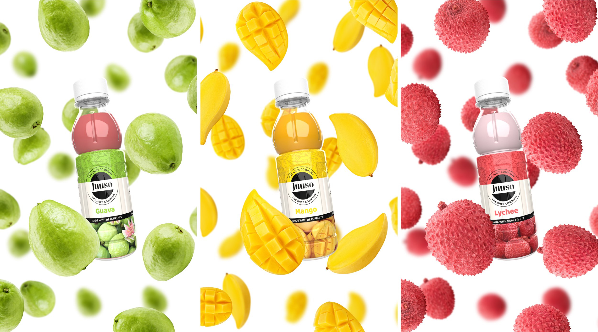
The next biggest hurdle was to communicate to casual visitors and passersby at a general store that these are packaged fruit juices, among a sea of packaged fruit juices. Bright colors and photographs of respective fruits make this obvious, even from a distance.
While this is not ground-breaking, it is just what the product needed at this point in time. Rome wasn’t built in a day, and neither will be Jusso’s dominance in India’s lifestyle. This is a mere declaration that a new player has entered the game.